
insights
EVS Dashboard Provides Daily Progress at a Glance
Using traditional paper checklists to assign daily assignments and tracking their completion, EVS managers have to contend with a major blind spot — the team is spread out over a large facility and paper checklists aren’t turned in to management until the end of the day — so they don’t really know, in real time, what work is being done and when.
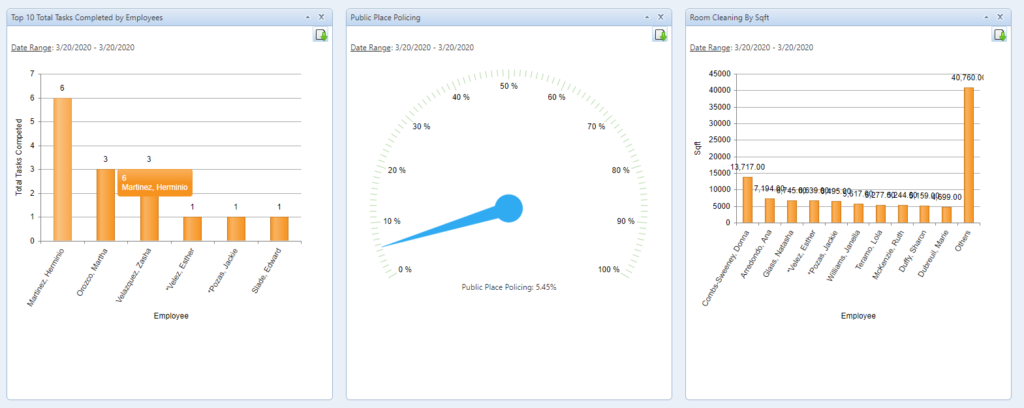
One of the most useful and unique tools in Service Optimizer is the EVS Dashboard. It gives EVS managers the ability to see the progress of their team as they complete their daily assignments. With the Service Optimizer dashboard at hand, managers can immediately see technicians tracking completed tasks on mobile devices as they go. This allows them to manage the process in real time to ensure that everything is going as planned. If there are hiccups, they can shift resources as needed.
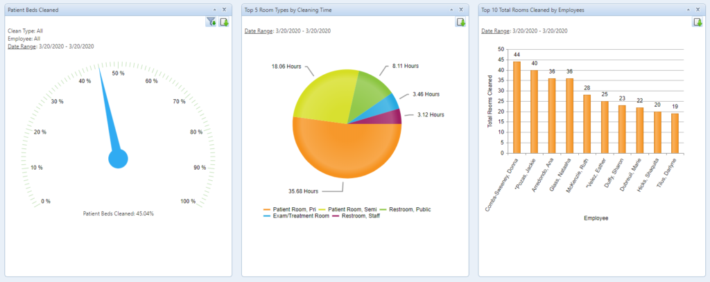
- The Dashboard tab displays up to nine different charts, such as:
-
- Percent completion rate for all assignments scheduled for the day (can sort info by employee)
- Percent of patient beds cleaned throughout the hospital
- Total tasks completed by employee (will show who is doing excessive amounts of add-on tasks versus more routine cleaning)
- Percent of tasks completed (and whether anything is outstanding and hasn’t been completed)
- Charts can be viewed by time period—today, yesterday, week, month, quarter, six months, current year, or custom.
- The dashboard charts can be re-ordered, so you can put your most frequently used graphs at the top.
- You can also create and add custom graphs with Graph Designer. Identify the metrics you want to view, select all or specific employees, select the data point, and specify a graph type.
In addition to the dashboard, managers can see more granular data on these screens:
- On the Employee Summary tab, managers can view a daily snapshot of which employees are logged in, how much work they’ve completed that day, and when lapses in service are occurring.
- On the History tab, managers can see everything that’s been performed by a specific EVS employee.
- The Tasks tab displays details about tasks. By clicking the pencil icon next to a specific task, you can see all of the items associated with that task and their status, color-coded by priority. Service requests submitted by managers or customers via text or QR code are colored orange.
- Clicking the pencil icon next to a specific item will show more details about that task, including a description of the work requested.
- The Patient Rooms tab details all of the patient rooms that have been cleaned that day, and indicates whether they were discharge or routine cleans.
- By clicking Complete/Incomplete rooms on the upper right side, managers can instantly pull a report of rooms cleaned and not cleaned in a day.
This essential Service Optimizer tool enables EVS managers to see workflow issues before they become a problem and reassign resources for the best outcomes.
Contact us today to learn more about Service Optimizer and schedule a demo.